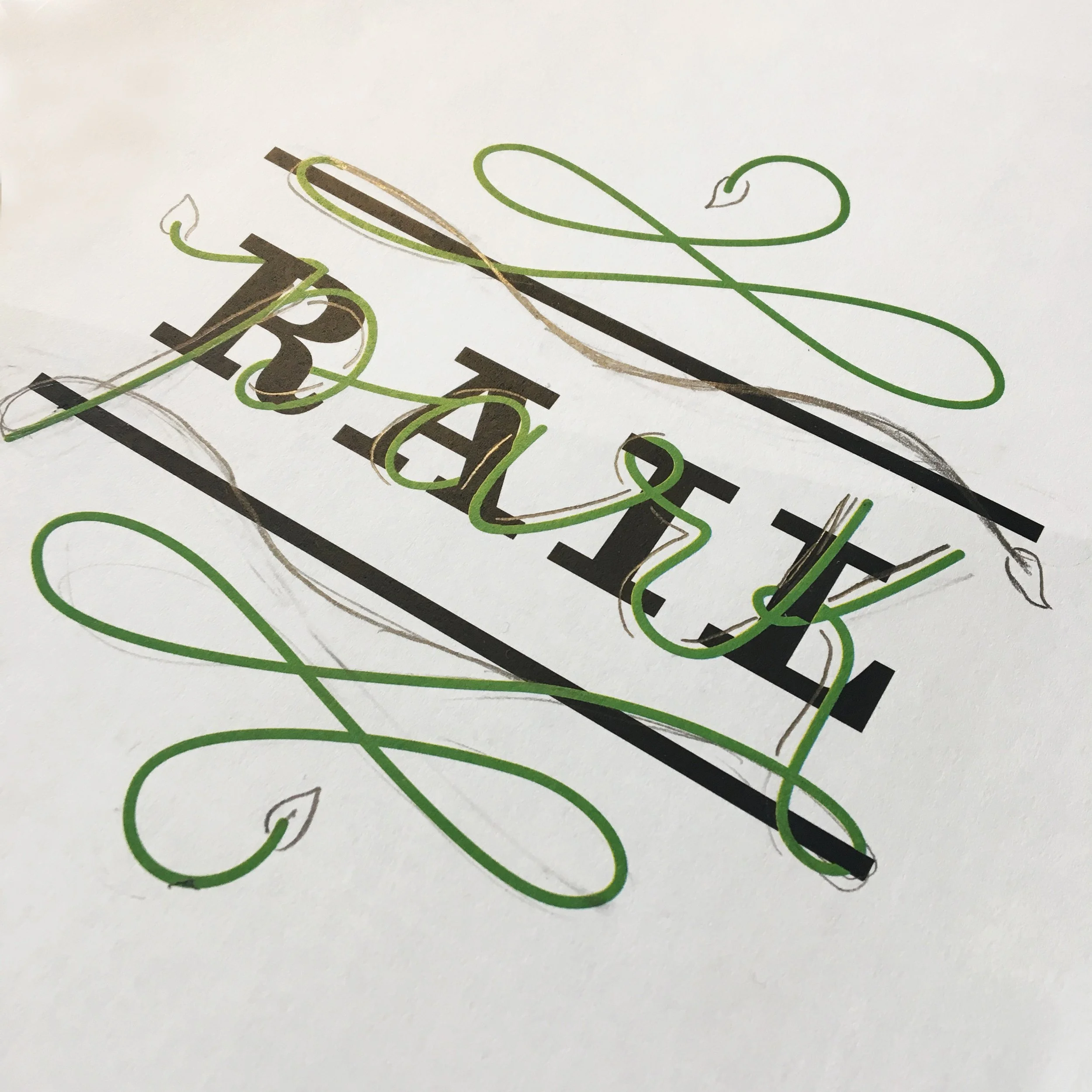
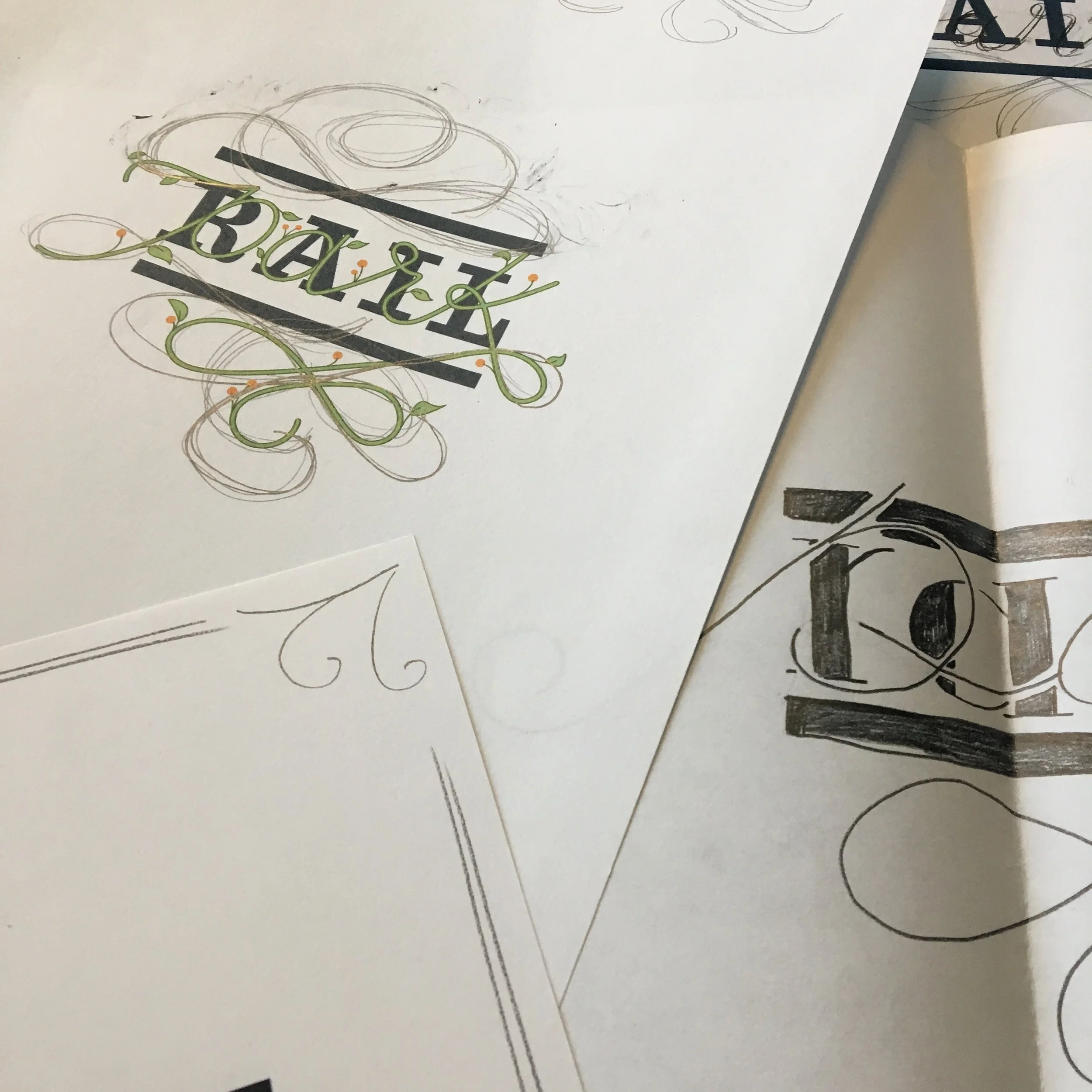
Rail Park Title Page
These sketches showcase my lettering design process for Excellence magazine’s title page for the Philadelphia Rail Park article. I experimented with the letters to visually show the literal contrast of structured railroad tracks and the organic shapes of the vines of a plant in a park. Using the two drastically contrasting words, I represented them visually while having them work as a complete unit. This article featured the work Urban Engineer’s did for Philadelphia’s Railpark project.


